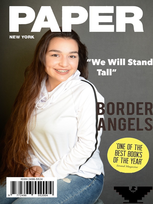
 The reason i chose this magazine was because i like now they keep it simple and don't add to much to it. The font i used was black to continue the simple look to it. The strops light was used to give a nice bright look to it. The grey card was used to make sure the the light was bright enough.
Theres not much to this its simple the way the magazine is supposed to be. MY WAY. Simple. Explains me. Thats it. there waS A reflector used to give a highlight and to avoid shadow.. Around the magazine are things like border angels which is an organization that help out those who are trying to get a better nice for themselves and their children. While mostly white racists closed minded greedy people try to bring us down the group will only get bigger to help those in need. They continue to try to stop us from helping but that only pushes us to do more. That was the purpose of my magazine cover to empower those looking for a change. To not lose faith on our people.
0 Comments
Leave a Reply. |
Authorit's lit Archives
May 2017
Categories |
 RSS Feed
